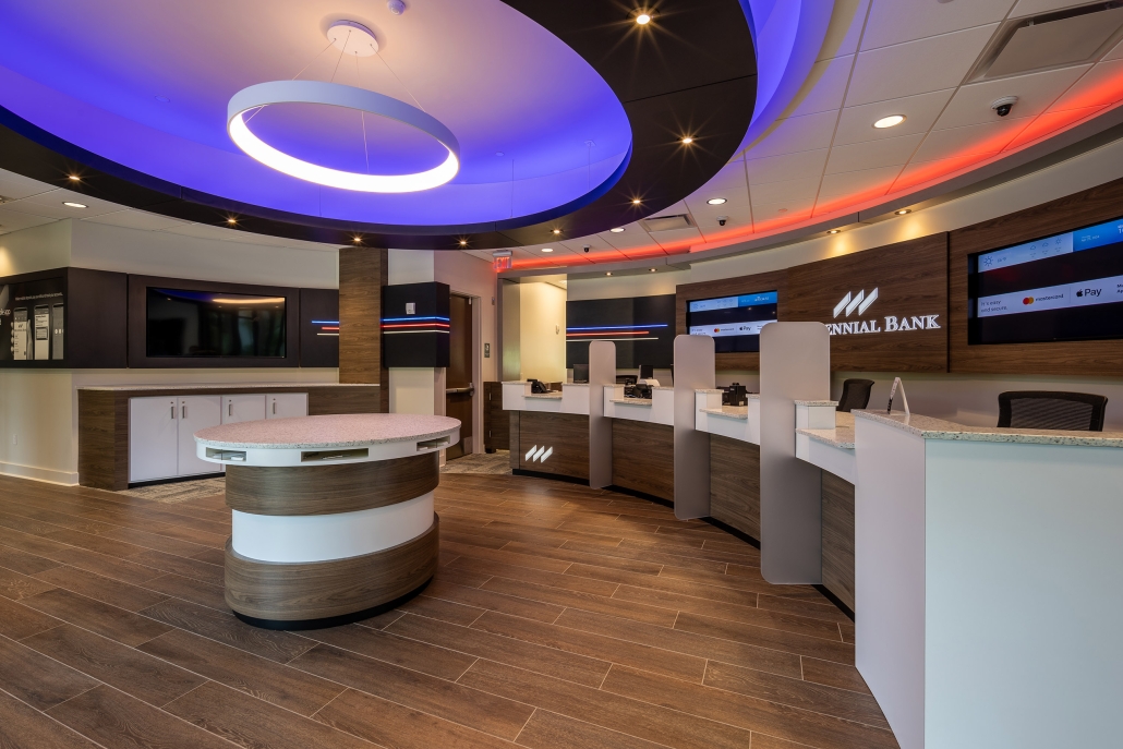
Why Your Bank Lobby Should Feel More Like a Café Than a Queue

Picture walking into your favorite coffee shop. Warm lighting, comfortable seating, the low hum of conversation, maybe a spot to sit and stay a while. Now picture walking into a typical bank lobby: a roped-off line, hard chairs against the wall, a teller counter that separates you from the person helping you. Same errand, getting something done with money, but two completely different feelings. That gap is exactly where branch design can either build loyalty or quietly erode it.

The Line Is the Problem

A queue tells customers one thing: get through this as fast as possible. It’s designed for throughput, not connection. And for years, that made sense; branches existed to process transactions. But most everyday transactions have moved to mobile apps and ATMs. The people walking into a branch today are usually there for something that matters: a mortgage conversation, a small business loan, advice on retirement savings, or a problem only a real person can solve. Greeting that moment with a rope line and a number ticket sends the wrong message before a single word is exchanged.


What Café Design Actually Gets Right

Coffee shops aren’t just pleasant by accident. Every design choice is intentional, and most of it translates directly to a bank lobby:

  • Seating that invites you to stay, not just wait. Soft chairs and low tables instead of a row of seats facing a wall.
  • Warm materials and lighting. Wood tones, layered lighting, and natural light instead of fluorescent overhead panels.
  • No hard barrier between you and the person helping you. A shared table beats a teller counter when the conversation is about something personal.
  • A reason to linger. Coffee, comfortable corners, even a bit of background music — small touches that say “you’re welcome here,” not “please hurry.”

Translating It to a Bank Lobby

This isn’t about turning a bank into a coffee shop. It’s about borrowing the psychology behind why café design makes people feel comfortable, and applying it with intention:

Consultation Nooks Instead of Teller Lines

Semi-circular seating around a low table, soft lighting, and a private-but-open feel turn a mortgage conversation or financial planning session into something closer to a living room chat than a bank appointment.

Let Technology Handle the Routine Stuff

Self-service kiosks and interactive teller machines can take care of quick transactions, which means the physical space doesn’t need to be built around a line at all. That frees up the layout and your staff for the higher-value, relationship-driven conversations that actually bring people into the branch in the first place.

Warm It Up

Natural materials, layered lighting, greenery, and a genuine sense of texture go a long way toward softening the sterile, institutional feeling that’s kept people bracing themselves before they walk into a bank for decades.

Why This Is Good Business, Not Just Good Design

None of this is purely cosmetic. Even in a digital-first world, most people still want a physical location they can turn to for the big, complicated financial decisions; the moments where they want to sit across from a real person. When that moment happens in a space that feels warm and welcoming instead of clinical and rushed, it changes how customers feel about your institution long after they walk back out the door. A branch that feels like a place to visit, not a place to endure, builds the kind of trust that shows up in retention, referrals, and long-term relationships, not just transaction counts.

The branches winning right now aren’t the ones with the most square footage or the newest ATMs. They’re the ones that made a customer feel like they mattered the moment they walked through the door.

Ready to reimagine your branch? Let’s talk about turning your lobby into a space customers actually want to visit.